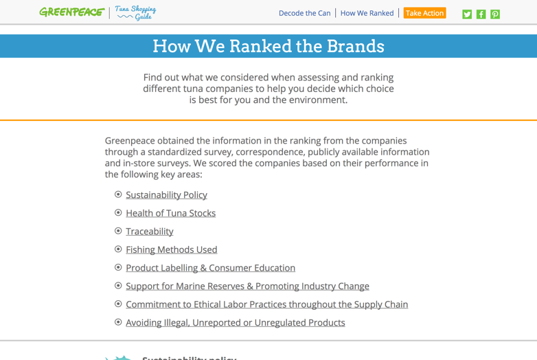
Every year, Greenpeace releases an annual report on tuna can rankings – providing information on which tuna brands are best for the environment and its workers. However, the report never has the impact or reach that it could have. Greenpeace reached out to us to design and develop a more interactive and engaging Tuna Ranking Guide, something that would stand out and be easy-to-use amongst their main audience – “progressive moms”.
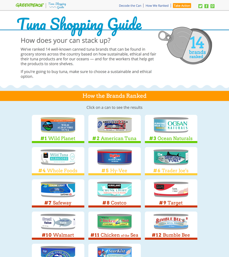
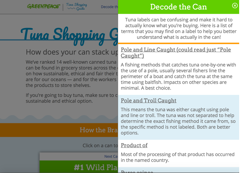
The goal of the website was to make a rather text-heavy tuna ranking into something fun and interactive. It was important for it to be mobile-responsive, making it easy for people to pull-up while they are grocery shopping or convincing their friends why they should stop eating a certain brand. We didn’t want this to be the standard PDF style report that is commonly published, but something that pulled from best practices in UX design, development, and visual design to create something captivating and engaging.
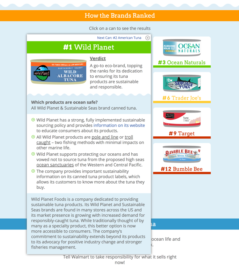
Greenpeace shared with us the text and data from the report. We discussed different ideas on how to best lay out and make the website interactive. From there, we created wireframes that visualize the architecture of the website. We then worked to create an overall brand and visual design for the Tuna Ranking Guide, pulling inspiration from Greenpeace’s current brand but creating something distinctly its own so the focus was on the consumer, not Greenpeace. We then added this branding onto the wireframes to create the overall look and feel of the website. Once approved by Greenpeace, we built the website using HTML, CSS, and JavaScript, incorporating social sharing and a call-to-action.
We launched the website and it did amazingly well. Within the first 2 weeks, 308,510 people visited the website, 3 times Greenpeace’s normal website traffic (the biggest driver of traffic was Facebook). Over 66% of visitors were either on a smartphone or tablet (so our focus on mobile-first was essential).